Actions
Lime for the primary action. Quiet gray for secondary actions. Visible keyboard focus.
THE PORTFOLIO, IN PARTS
The colors, type and little interactions behind this portfolio. A living UI kit, built from the same styles as the site.
Download tokens ↓Every foundation token, side by side. Day and Night share the same roles; small color samples keep the values easy to compare.
Project artboards and tags retain their existing brand palettes.
Regular for reading. Medium for headings and controls. Semibold for a little emphasis.
Feel simple.
Fluid display · medium · tight trackingRoles, information and interface states, considered as one product.
17px / 1.5 · regular · card and supporting copy use smaller sizesTHE WORK BETWEEN THE SCREENS
11px · medium · 1.4px letter spacingTry the controls. Switch Day and Night in the header to see this whole page respond.
Lime for the primary action. Quiet gray for secondary actions. Visible keyboard focus.
Pick a mood. Press play.
From turntables to your ears.
A quiet outline around the group, a lime fill for the selected option.
No surrounding box. The underline strengthens on focus. This sample does not unlock cases.
A soft product-colored surface, compact type and no dashed outline.
 DOCUMENT WORKSPACE & DESIGN SYSTEM
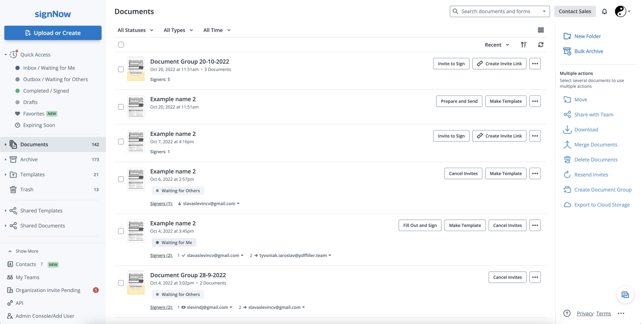
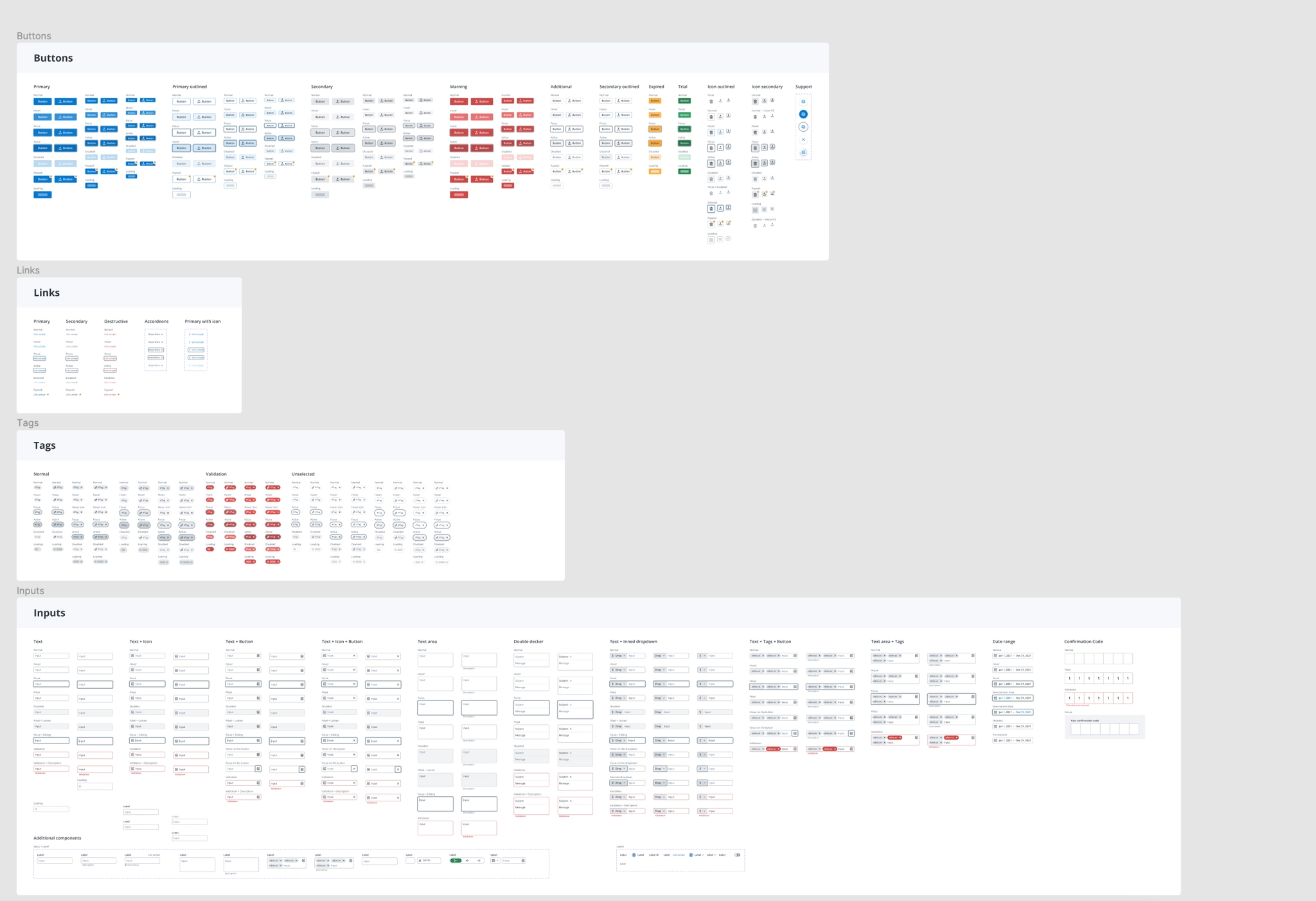
From a legacy interface without source design files to a shared system and redesigned core screens.
A four-pixel spacing vocabulary, generous sections and compact controls. Layout adapts at the site’s existing 700px and 1050px breakpoints.
200ms for small control transitions. 500ms for project-cover movement. Drawn accents reveal as their sections enter the viewport.
Reduced-motion preferences stop decorative animation and remove transitions.
The same line-work and shared ink color, with less detail as the image gets smaller.